When you think back to who the dating site OGs are, you might not even think of Match. Probably because you weren’t born when they were founded. Because I sure wasn’t. Match.com is one of the oldest dating platforms around, having been in the online dating scene since 1995 and is still around by nothing short of a miracle.
Think about how fast things expire on the internet: Snapchats only last a second, Instagram stories are fleeting, and let’s not forget Vine (RIP).
How is Match.com still around? Is it a time capsule much like the Space Jam website? Or has Match changed with the times? How does Match stand up against a whole new generation of dating apps?
I – a millennial guy – joined Match to give you my full and comprehensive review. Read on for my Match.com review, and discover how this dating site trailblazer fairs against today’s competition.
First Impressions
Okay, let’s be honest: Match.com could use a little help in the graphic design department. Their site does look very early 2000s to me. I feel that they could use some serious rebranding (they should take a note from the way eHarmony has reincarnated over the years).
The Match.com homepage is, for want of a better word, busy. It bombards potential users with information from every angle, including everything from their active user base to their business practices. Talk about information overload. Users are here to find someone to bang, not read mini-blogs about dating.
After the initial sign in screen, Match.com improved drastically. I’m actually quite pleased with the layout of the sign up screens. I think that the blue screen and white text is actually quite sleek and beautiful, not to mention much easier on the eye than the home screen.

The sign in screen is easy to use. You’re asked the important questions: what you want in a partner, if you drink, if you smoke, your relationship status (not every member is single!). And you’re asked to fill out a short “about you” Only 100 words! This is such a great balance between sign-up-and-go-for-it and let’s-ask-you-about-every-tiny-detail-of-your-life.
I was a big fan of the sign in process. However, once you’re in the site, it’s back to the same ol’ shitty, dated, bulky looking graphic design.
It makes sense that the Match.com target audience is users in their thirties (I’m guessing it is because on the login screen it has pre-populated answers for what you’re looking for, and the age range was prepopulated with “between 35 and 45”). Though, I think that any generation would be attracted to slightly better graphic design. Nothing too cool that it would be off-putting, but something simple and sophisticated.
Dating apps are like partners in that way, huh? You want someone that looks good just like you want an app that looks how you want to feel.
Overall, first impressions of Match.com are a mixed bag. It definitely gives off “reputable online dating site” vibes, even if those vibes are reminiscent of a previous decade. But still, Match has 20 million users for good reason. It must be doing something right (despite what a lot of reviews say).
Features
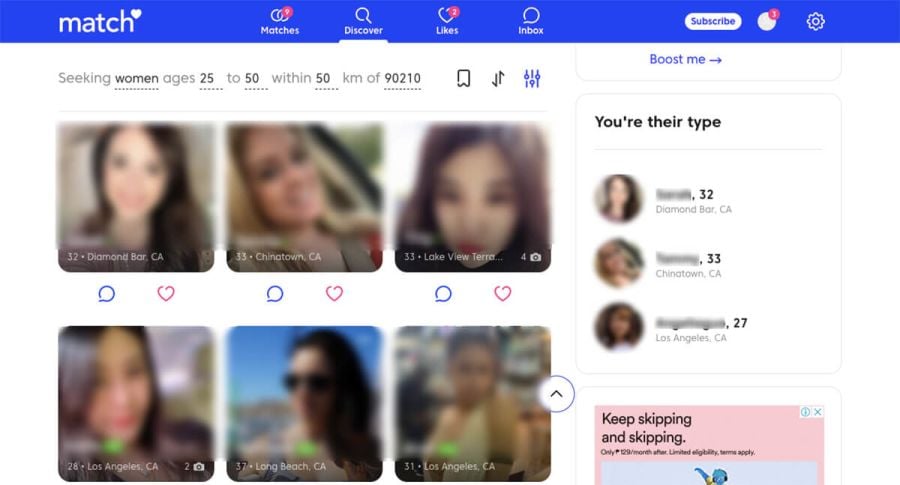
Match.com has done a great job of integrating the classic searchable grid dating site style with the Tinder-inspired matches approach. I think that they’ve created a great way to swipe through users without rendering the grid completely useless or undesirable.
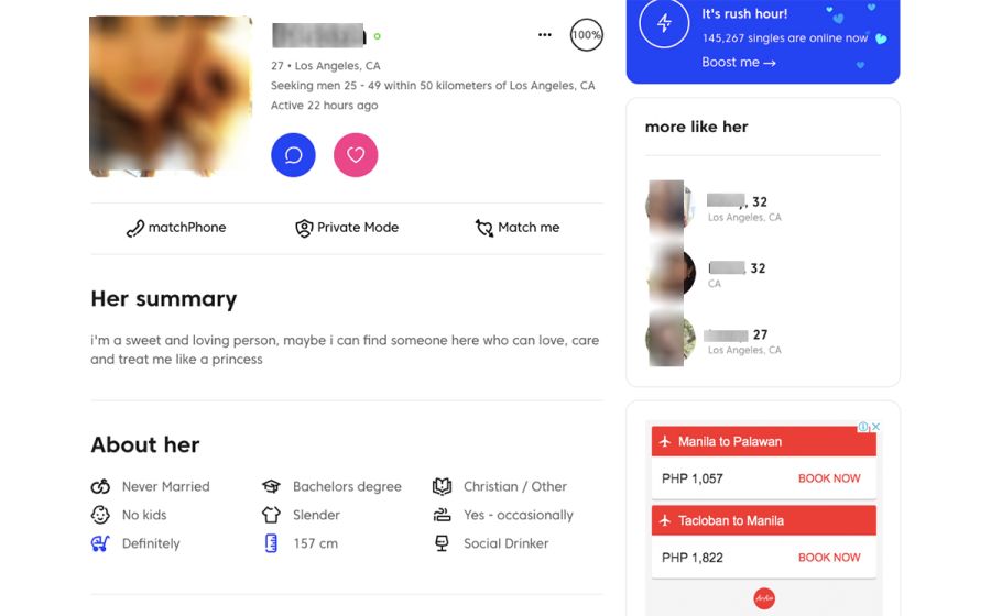
When it comes to profiles, upon sign up, you’re only filling out some of what your profile has the potential to be. There are tons of questionnaires on Match.com, like what kind of pets you like or what your current goals are. This helps for those of us out there (which I know is most of us) talk about ourselves without sounding redundant.
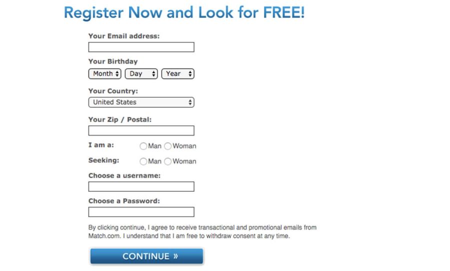
Profiles do need a limited number of information before you’re let loose on other users though. This includes your age, zip code and at least one photo.

Or, if you don’t want to answer your own profile questions, you can have a professional do it for you. Granted you’ll have to pay forty bucks for someone to do it for you, but if you’re really trying to get a good match, it could be worth spending that money to have a dating profile pro fill your profile out instead.
I think this is a great feature for those busy professionals or for those who’ve failed at dating apps in the past but are looking for a long-term partner. Your luck on Match.com lives and dies by your profile, so it’s important to make it a good one.
In addition to these special little features, you’ll find the basic messaging and search function capabilities you’ll find on most dating apps. You can message any member you come across, and you can message any users you match with on the Tinder-esque swipe system.
Additionally, Match.com has a couple of unique features you might not find on any other dating services. It’s as much as a social media platform as it is a match-making site.
The first is the “Reverse Match” feature. This nifty little addition shows you a list of women who are searching for someone like you. For example, if you have any unique keywords in your profile or have certain physical traits, you’ll find all the members searching for those.
Next is the “Missed Connections” feature. This is great for users who might have crossed paths in real life without being aware of it. That gorgeous woman on the subway? That librarian you’ve been perving on for the past six months? Check out this tab and you might find that same person is looking for you too.
Sending and receiving messages is as simple as it comes. There are two options, standard messages and quick messages. They’re more or less the same, except standard messaging opens in a new window and allows the use of emojis and stickers, while quick messaging opens up below the person’s profile on the same screen.
Pricing and Membership Details
Match.com has two subscription plans: Free Membership and Premium Membership.
And let’s be real, if you want to use Match.com at all, you’re going to have to go Premium. Really, if you want any hope of getting regular matches, you’re going to have to pull out the credit card and get the paid membership.
Don’t believe me? Okay well here’s what you get for free:
- Daily matches
- Search for matches
- Your profile will appear in match results
- “Wink” at other Match members
- View member profiles (5 per day).
That’s it. Not exactly a whole lot to do.
Here’s what you can do if you decide to upgrade:
- Send messages
- Receive and reply to messages
- See which members have viewed your profile
- Block members
- Monthly profile boost
- Access to Match customer service
- One profile review per year by Match.com staff
- Leave reviews for other members
So, if you want to communicate other than with smoke signals and psychic linking you’re going to have to upgrade. Here’s what Premium Membership will cost you:
- 3 months for $28.99 per month
- 6 months for $24.99 per month
- 12 months for $21.99 per month
If you were to go with the six month option, this site would cost you $300 a year to use. And that’s not guaranteeing a match or any success really, that’s all on you.
The three month and six months subscription are both okay, but compared to some other similarly-sized dating websites like eHarmony, it definitely seems on the higher side. But if you want to find your perfect match, you’re gonna have to swallow these prices.
Unfortunately, there’s no one month subscription or trial subscription available.
In addition to these membership packages, Match.com also offers a few additional paid upgrades known as Power Ups. These include:
- Email Read Notification – Know when the emails you have sent to other Match members have been read
- Highlighted Profile- Includes a highlight around your profile and primary photo to make them more prominent in search results
- First Impressions – Be seen first by new members. Your profile will be included in the first round of emailed matches sent to the newest members of Match in your area
- Match Phone – Talk and text without sharing your number on your own phone
- Private Mode – Control who sees your profile by making yourself visible only to the people you choose
- Reply for Free – Allows any free member to reply to a subscribers message at no cost to them
- Top Spot / Boost – Get on top of search results for 60 minutes.
- Match Me – Appear in the Daily Match results of another member who has the same or similar interests as you
- Undercover – Allows you to view and favorite profiles for 24 hours without your matches being notified
Some of these features are pretty cool, especially Highlighted Profiles and First Impressions. However, they’re not required to enjoy and find success on Match.com.
Pros
Registration is as easy as inputting a username, password and email address. You can also provide a phone number in case you need to recover your account or reset your password at a later date.
Detailed profiles: For me, the way that profiles are structured is a huge plus for me. I love how the essay questions and prompts help you talk about yourself in a way that isn’t self-indulgent and helps you reveal important information about yourself.

I think that the number one place that everyone screws up on dating sites is when it comes to their bio. What you think is the most important thing about you might not resonate with the masses, or it might actually be really off-putting. Match helps make this a non-isue.
Percent match: One thing I hate about modern dating sites is that you match with someone, but there’s no insight into what that match is based on. With dating sites like Match.com, you’re actually shown what percent of answers potential matches have had with yours. Whether it’s bedroom compatability, personality compability or similar interests compatability.
This way you know that you’re not just matching with someone because they’re the opposite gender, but you’re matching because you have a similiar education level, interests or whatever else.
Events and webinars: I love dating services that hold events for their members! This is such a great way to make dating personal again. Match.com hold mixers and other singles nights, which is great for those members who shine in person and less so online. Having the option to find someone in real life has well in the online dating space is a double win.
Match.com does indeed have a massive and very active member base. There’s no denying that your dating pool and potential matches will be huge, perhaps the most out of any traditional online dating platform. As of January 2021, there are somewhere in the region of 20 million users, about 17 million of which are active.
For a site of Match’s caliber, you’d expect it to have its own mobile app. Luckily it does, so you can keep hitting those daily matches as you go about your business.
On the subject of making matches on the move, the “Missed Connections” feature is a nice little addition. As mentioned up above, this feature lets you reconnect with that good-looking man or woman you saw on the train but didn’t have the guts to approach.
Cons
Fake profiles. Every online dating site has them. They’re unavoidable. Match.com is no exception, boasting more than its fair share of scammers. However, you don’t need an eagle eye to spot these scammers. There’s always a dead giveaway in their member profiles that they’re not a real person.
The search filters are a bit meh. While you can be specific with your search criteria, you’ll have to scour through search results to find the most relevant matches. Search results aren’t laid out very well at all. The only good thing about the search feature was that you can search by first name; pretty useful if you’re looking for someone in particular.
One thick ass paywall: While I really appreciate this app and what it’s doing for its customers, I think that the price is pretty steep. I think that people who are well established in their career can afford this site, but young people just can’t or don’t feel the rush to yet.
While the six month option is the most popular, it’s still a lot of cash to fork over. There are other sites that do similar things for a much lower price point. Hell, POF and OKCupid do it for free.
Conclusion
As both a dating website and social media app rolled into one, Match.com is a great place to meet that man or woman you want to spend your future with.
Personally, I think Match and I are from very different times. I think that if I were in my thirties, I’d want to join Match. But as of right now I think that there are other younger-feeling dating apps – like eHarmony or POF – that suit my needs.
However, if you’re looking to seriously date people in their mid to late thirties or older, I think that Match is the app for you.
4/5 Stars
We hope our Match review has helped you decide whether this site is for you or not. Please check out our other reviews to find the right plaform for you.
Ready to Try Match.com
FAQs
What is Match.com?
Match.com is an online dating app which serves users in over 50 countries worldwide. It’s a platform for users to find a long-term or serious relationship.
Is Match.com a scam?
No, Match isn’t a scam. It’s one of the most reputable and long-lasting dating sites in history. As of January 2021, it has over 20 million active users.
Is Match.com free?
Match is not a free site, although it does offer a free membership with limited accessability. However, to enjoy the site’s full features, you’ll need to purchase a Premium Membership. This can cost anything from $21.99 to $28.99 per month.
Is Match.com better than POF?
Both Match and POF are very similar in terms of user base and user intentions. They’re both sites which cater to those looking for serious relationships. The main difference between the two is that Match requires a paid subscription while POF is free.
How do I cancel my Match.com subscription?
In the top right of the app screen, click “My Account Settings.” From here, navigate to “My Subscription Settings.” Click “Cancel Subscription.” You can do this up to 48 hours before your account subscription is due to renew.
To delete your entire account, go to “My Account Settings” and then “Suspend My Account.”

